dash dash force Misadventures in software engineering
Custom Sliding Checkboxes

Default browser checkboxes are boring. So boring that as of this writing there isn’t much you can do with them besides simple resizing or color tweaks because their appearance is tied to your operating system. But what do you do when your UI/UX guy comes at you with some crazy design for a checkbox that isn’t even remotely close to what you can do with browser defaults? You take that default checkbox, chop it up, hide it under the floorboards and pray it stays there. But really, you hide it and make something better. Heres how to do it.
The Problem
Lets say instead of having a default checkbox like this:
See the Pen basic checkbox by RM-Terrell (@RM-Terrell-1472442891) on CodePen.
You instead want to implement a sliding on / off switch that looks something like this:
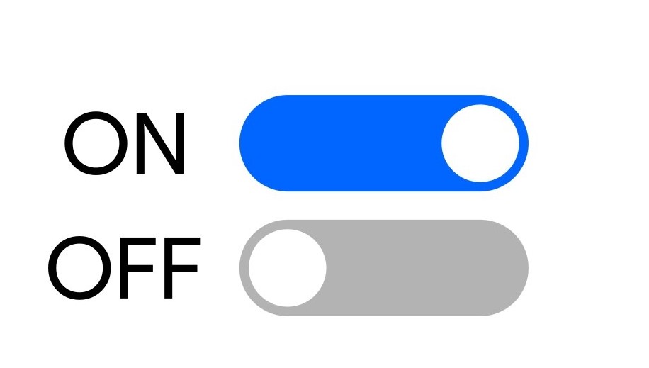
Quite different appearances with the same functionality. Currently input fields of type “checkbox” can’t be changed too extensively. Their appearance is determined by the operating system you are viewing them from, so a machine running MacOS with Firefox will show MacOS style checkboxes in the browser, while a Windows machine will show Windows checkboxes. You can resize them and a few other basic tweaks but nothing so extensive as what we’re going for.
The Solution
To fix this we will have 4 main steps:
- Hide the original checkbox, but keep its HTML present on the page for tracking its
checkedstate, thus allowing us to make use of the.checked()method in JavaScript for tracking user input. - Create a new styled, animated slider that matches our desired behavior and appearance. Or whatever you want, go nuts.
- Have step 2 utilize a
<label>tag, and place the hidden<input>inside the<label>. This acts to capture click events, and automatically passes them on to our hidden<input>, “checking” the checkbox for us. - Use the
checkedstate of the hidden<input>to drive our custom animation.
The basic HTML structure looks like this:
<div class='sliding-switch-wrapper'>
  <label class="sliding-switch" for="testing-checkbox">
    <input type="checkbox" id="testing-checkbox" />
    <div class="slider round"></div>
  </label>
</div>
First up to hide the default <input> we use the CSS rule:
.sliding-switch input {
  display: none;
}
This both prevents the element from being rendered to the user, and from taking up space on the page. However the actual HTML is still present to be manipulated and accessed, which you can verify by using your browser dev tools to inspect the page. This is important as we will be changing and tracking its checked stated later.
At this point you can probably see my intent in the class names. The label itself will act as the horizontal bar of the slider, and there is a div that will create the round part that slides back and forth when the user clicks it. To style it as such we can use the following CSS rules:
.sliding-switch {
  display: inline-block;
  height: 15px;
  position: relative;
  width: 44px;
  top: 50%;
  transform: translateY(-50%);
}

.sliding-switch input {
  display: none;
}

.slider {
  background-color: #c1c1c1;
  bottom: 0;
  cursor: pointer;
  left: 0;
  position: absolute;
  right: 0;
  top: 0;
}

.slider:before {
  background-color: #878e95;
  bottom: -3px;
  content: "";
  height: 22px;
  left: 0px;
  position: absolute;
  width: 22px;
}

.slider.round {
  border-radius: 34px;
}

.slider.round:before {
  border-radius: 50%;
}
Note: almost all of these rules are my personal choice, and can be modified at will to change this thing to look however you want. The position, cursor, and display rules are the one that can’t really be changed for the sake of functionality.
This gives us the following result:
See the Pen sliding checkbox static by RM-Terrell (@RM-Terrell-1472442891) on CodePen.
The appearance for the off state is what we want but it doesn’t slide or change colors. To do that we are going to make use of the CSS features transform, transition and also add styles specific for the state after the transition has occurred. But what do we tie the animation and color change too? Clicks? Nah we have something better and more closely coupled to what we really care about. Remember how we wrapped the whole thing in a <label>? Well whenever you click the slider (any part of it, the bar or the round part since its all in a label tag), in the background the <input> element we have hidden is having its checked state updated.
A HUGE reason to do this, is that if say we set the checked state with JavaScript, the styling will update too. A use case example: the slider controls the state of some setting in a web app, and a user navigates to the settings webpage. On loading the page we have JavaScript code that sets the setting state based on data from the database. If we were to tie the slider position to click events, we would need to set the state on page load with a click event in JavaScript which is less than ideal. But with this solution we can update the checked state and the slider will render into the correct position.
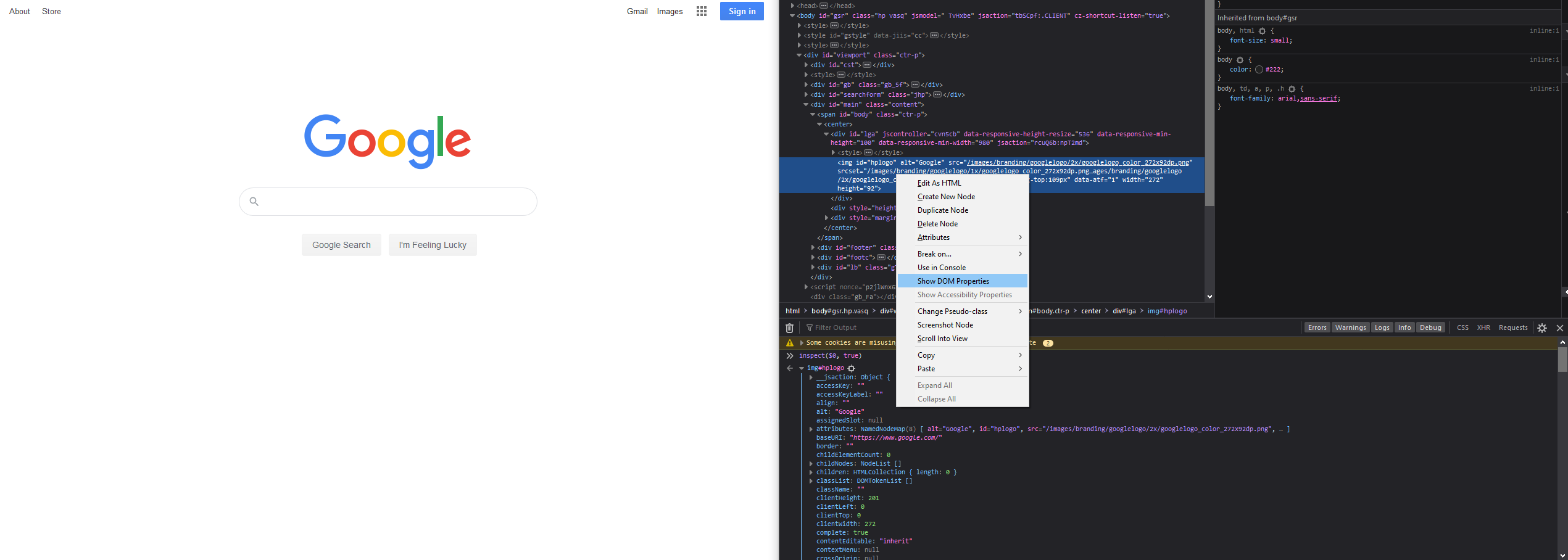
You can verify this with browser dev tools for inspecting a DOM elements properties. Firefox has a very nifty option in their dev tools where you can right click any DOM element and log out its properties straight to your dev console, including its checked state.
As such we use the CSS rule
input:checked {}
to apply styles only when the input is checked. The resulting code looks like this:
.sliding-switch {
  display: inline-block;
  height: 15px;
  position: relative;
  width: 44px;
  top: 50%;
  transform: translateY(-50%);
}

.sliding-switch input {
  display: none;
}

.slider {
  background-color: #c1c1c1;
  bottom: 0;
  cursor: pointer;
  left: 0;
  position: absolute;
  right: 0;
  top: 0;
  transition: 0.3s;
}

.slider:before {
  background-color: #878e95;
  bottom: -3px;
  content: "";
  height: 22px;
  left: 0px;
  position: absolute;
  transition: 0.3s;
  width: 22px;
}

.slider.round {
  border-radius: 34px;
}

.slider.round:before {
  border-radius: 50%;
}

input:checked + .slider {
  background-color: #6287c1;
}

input:checked + .slider:before {
  transform: translateX(24px);
  background-color: #2b559a;
}
You can see at the bottom we have added new rules for the input:checked, and also added transition rules to the slider to make it move in a visually appealing way. Here’s a live example of it:
See the Pen sliding checkbox animated by RM-Terrell (@RM-Terrell-1472442891) on CodePen.
And with that we have a new, CSS only, custom slider that can be accessed and updated with JavaScript as if it were a vanilla checkbox!
Happy CSS styling!
Written on June 12th, 2020 by RM Terrell Photo credit of RM Terrell